
The Laurel Group
Flyer Design | Print Design
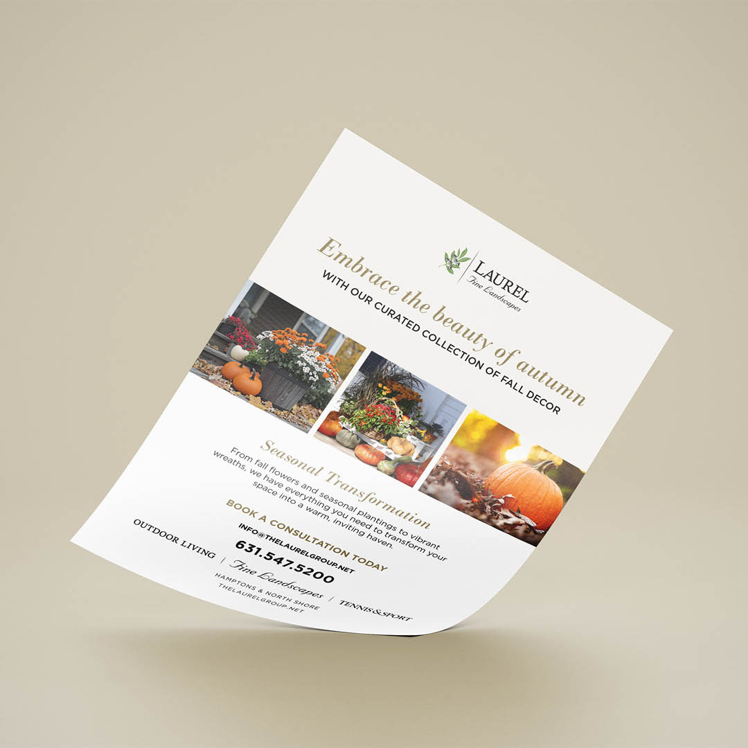
This flyer was designed to evoke warmth, elegance, and seasonal charm. I used a rich autumn palette to reflect the coziness and vibrancy of fall.
Typography is minimal and modern, allowing the visuals to lead while maintaining clarity. The headline is set in a graceful serif to add sophistication, while the supporting text is structured for easy reading. I balanced white space with visual density to create a sense of calm and luxury. The flyer’s overall tone is aspirational yet grounded.