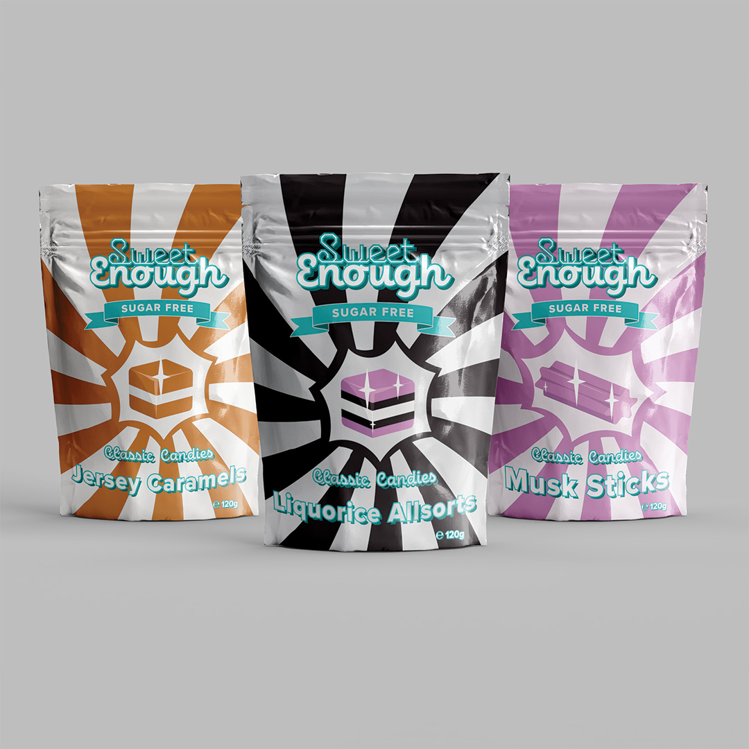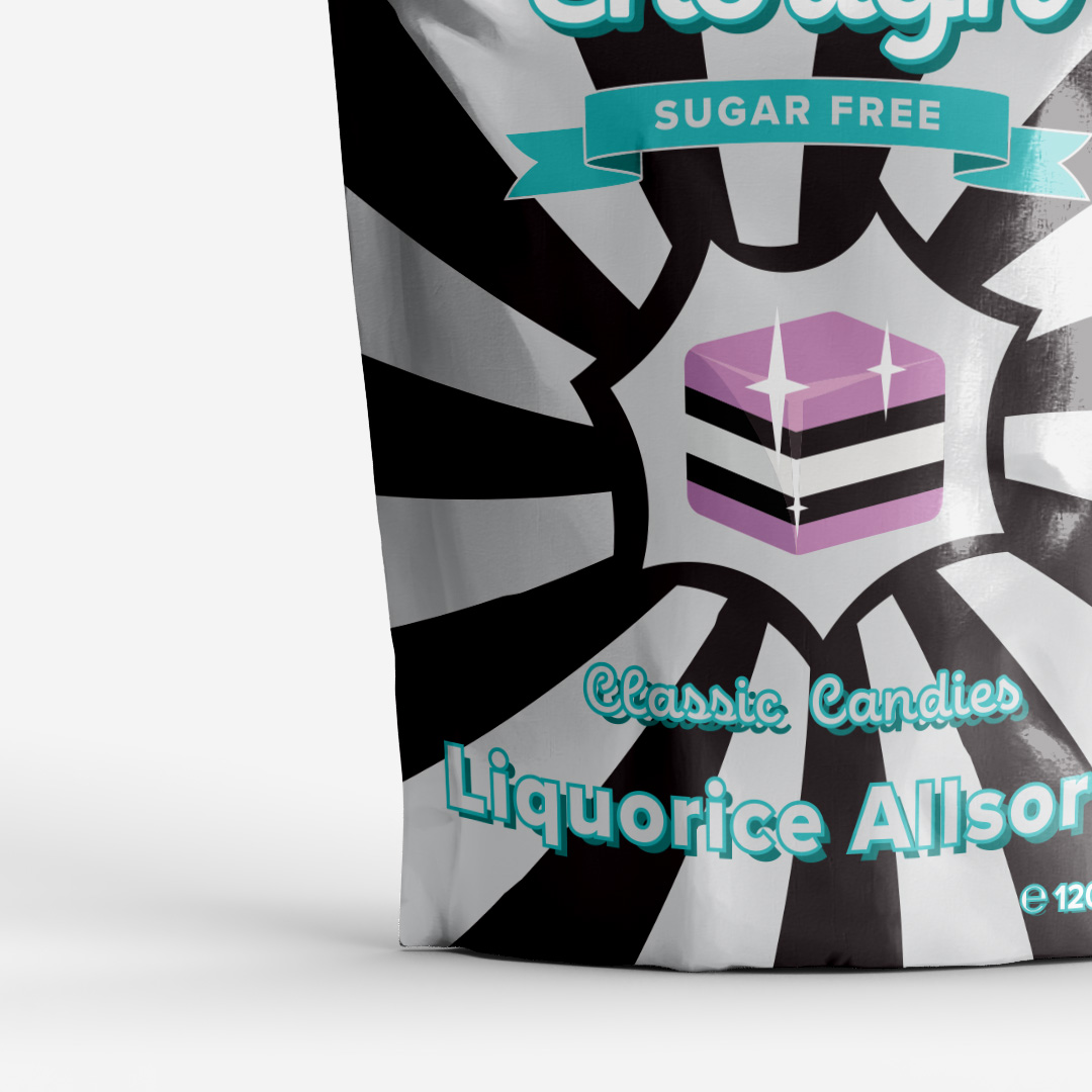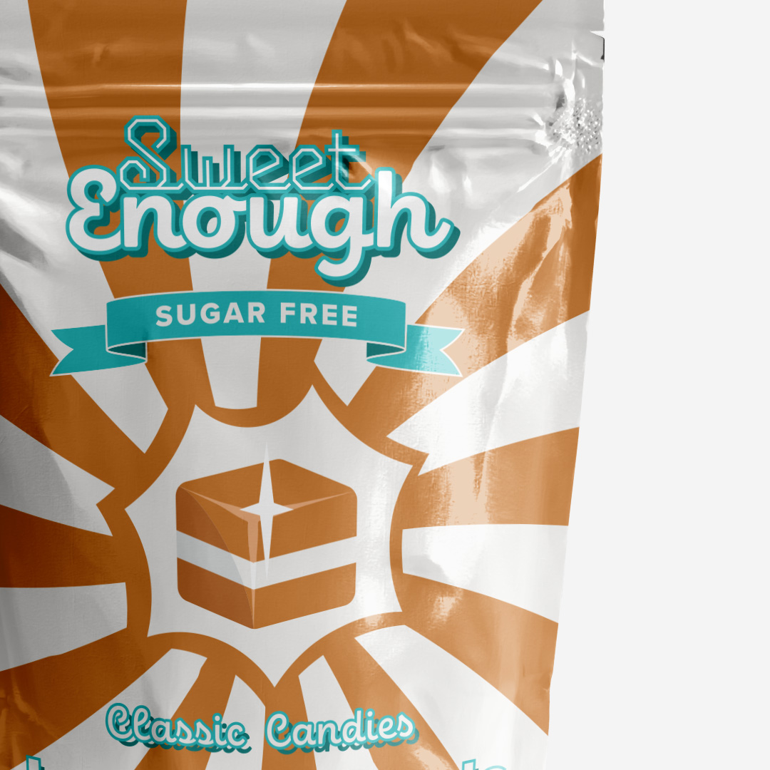

Sweet Enough
Packaging Design | Print Design
The packaging design for this candy product had to be “vintage” and emphasise the fact that it was sugar-free.
I drew inspiration from early to mid 1900s packaging throughout the concept phase, which frequently featured simple colours, motion, straightforward imagery, and curved lettering.
I opted to take a modern approach to the packaging itself in order to be more environmentally friendly, and I integrated these designs’ aesthetics utilising modern procedures to boost efficiency.