
AM Déjeuner
Billboard Design | Print Design
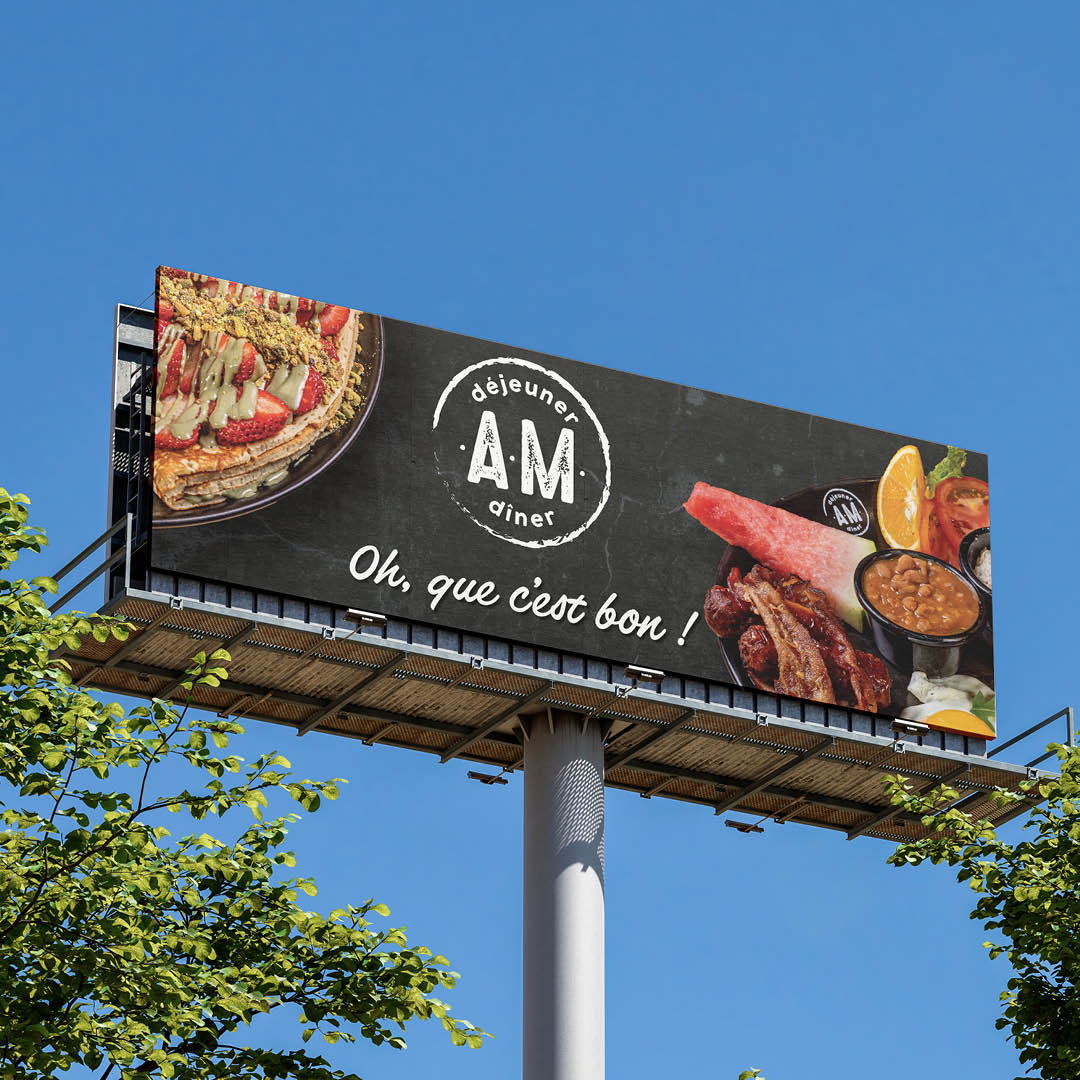
Typography was kept bold and legible, with “AM déjeuner diner” centered to establish brand identity and “Oh, que c’est bon !” adding warmth and enthusiasm. The phrase placement and font choice were meant to feel welcoming and familiar.
The layout balances visual weight between the two food images, drawing attention from both sides and anchoring the message in the center. I used a high-contrast palette and clean spacing to ensure readability from a distance, especially against the sky and natural surroundings. The overall design aims to trigger cravings and convey comfort.